Fragrance Direct: A new brand meets an old CMS Integration
UX | UI | Branding | CRO | CRM
1 Year // Now reacquired.

During a company acquisition by a previous employer named allbeauty, I was tasked with redesigning the Fragrance Direct website to ensure integration with allbeauty’s in-house CMS system.
The goal was to create a cohesive user experience while maintaining brand identity. The challenge was balancing consistency between both brands while keeping the design intuitive and engaging and catering to a younger target market.
During the website redesign, several issues were identified when integrating Fragrance Direct’s existing site with allbeauty’s CMS. Our goal was to enhance the user experience while maintaining a familiar and intuitive journey, whilst also giving the existing wireframes an overhaul and considering new features.
Top tip: To make the problem statements stand out, they have been highlighted in pink for easy reference in this case study.:)
Navigation
Users had difficulty navigating the existing Fragrance Direct website due to its complex four-tier menu, which overwhelmed them with too much content. This made it harder, especially for younger users, to find products quickly, leading to frustration, higher drop-off rates, and a poor shopping experience.
How might we simplify the navigation structure to improve usability while maintaining access to key product categories?
A two-tiered navigation system and simplified category ranges enhance usability by reducing cognitive load, improving discoverability, and creating a clear information hierarchy. This makes it easier for users to find what they need quickly, minimises decision fatigue, and ensures a smoother, more efficient browsing experience—especially on mobile. Plus, it boosts SEO and site performance by streamlining navigation and improving page structure.

✅ Since FD's target audience is younger and tech-savvy, universally recognised icons replace text labels, making navigation more intuitive.
✅ Icons now include alt text for screen readers, ensuring accessibility without the need for additional labels.
✅ Additional space was allocated for search functionality on 900-pixel tablet screens, improving usability.
✅ Indentation and colour differentiation help users easily distinguish between main categories and subcategories.

✅ Arrows were removed from subcategories that lead to main pages, reducing unnecessary visual clutter.
✅ Categories open and close when activated, keeping the menu organised and easy to navigate.
✅ Labels were removed, and icons were right-aligned to facilitate seamless translation across languages.
✅ All improvements maintain SEO integrity, ensuring the website remains optimised for search engines.
Homepage & establishing trust
With the introduction of a new design and system, both existing and new users might experience uncertainty about the site's legitimacy, leading to potential trust issues. The aim here is to retain original customers while attracting a new, younger demographic, so that a wider target audience could be reached.
How might we reassure users to help them feel confident, reinforce Fragrance Direct’s credibility, and maintain customer loyalty?

USP Bar for Brand Trust:
40px-high USP bar across all devices highlights key selling points, reinforcing what sets Fragrance Direct apart from competitors. It rotates through four messages with embedded icons for added clarity.
Big Cookies Messaging:
A prominent cookies demonstrate transparency and compliance with data privacy regulations (such as GDPR). It reassures users that their data is being handled responsibly, which builds trust. This is especially important for new visitors who might be cautious about sharing personal details or making purchases.
Quicklinks for Easy Navigation:
Users can quickly jump to their favourite brands and categories, reducing scrolling and increasing discovery. Featuring well-known brands enhances trust and credibility.
Engaging Tone of Voice:
Using a friendly and inviting tone, such as “Find what you love,” helps establish a sense of authenticity and relatability, making the brand feel more approachable and modern. Younger users are more likely to trust and engage with a brand that speaks their language rather than using overly formal or outdated phrasing.
Want to see more homepage decisions?
Download the PDF below! Or you can continue reading…
Bestsellers & Popular Products
Users need an engaging way to discover bestselling, trending, and popular products that inspire confidence in Fragrance Direct. The challenge is to balance key information, visual hierarchy, and user interaction while ensuring brand consistency, responsiveness, and seamless performance across all devices.

How might we design scrollable product cards for Bestsellers, Trending, and Popular Products?
The design ensures a seamless and engaging product discovery experience by:
Auto-rotating every 7 seconds to showcase products effortlessly.
Pausing on hover so users can focus on specific items.
Permanent pause on interaction for better control.
Mobile gesture support for intuitive swiping.
Adaptive swipe speed for a responsive experience.
Ellipsis on long titles to maintain a clean, consistent layout.
These features balance visual hierarchy, user interaction, and brand consistency while ensuring smooth performance across devices.

Image: Keys were designed to display the dimensions for each BPS, so the dev team could efficiently code without the need for guesswork.
Ecommerce UX Redesign:
Product listing and detail pages
When redesigning the listing and product description pages, my primary focus was to enhance usability, improve navigation, and create a seamless shopping experience. I prioritised clarity, efficiency, and user trust to drive conversions while maintaining a visually appealing and mobile-friendly interface.

Clear Visual Hierarchy
I ensured product names, pricing, discounts, and ratings are easily scannable with consistent typography and spacing for quick decision-making.
Efficient Navigation
Breadcrumbs enable easy backtracking, while pagination prevents infinite scrolling, making browsing smoother.
Strong Calls to Action (CTA)
High-contrast “Add to Bag” buttons provide instant feedback, preventing duplicate actions and reassuring users.
Trust & Credibility
Star ratings and reviews offer social proof, helping users feel confident in their purchases.
Mobile-First Design
Optimised for mobile with large touch targets, a responsive grid, and intuitive interactions for a seamless experience.
Visual Cues for Engagement
“Free Gift” tags highlight promotions, while wishlist icons encourage saving and boost conversions.

Clean & Focused Layout
A distraction-free design keeps the product as the focal point, with essential details like price and reviews easily accessible.
Easy Colour Selection
Interactive swatches let users preview and switch shades instantly, enhancing exploration without page reloads.
Transparent Pricing
Clear formatting of the original price, discount, and savings ensures users immediately see the value.
Strong Social Proof
Star ratings and reviews build trust, reassuring users and driving conversions.
Seamless Interaction
Wishlist functionality and a cart notification badge make saving and purchasing effortless
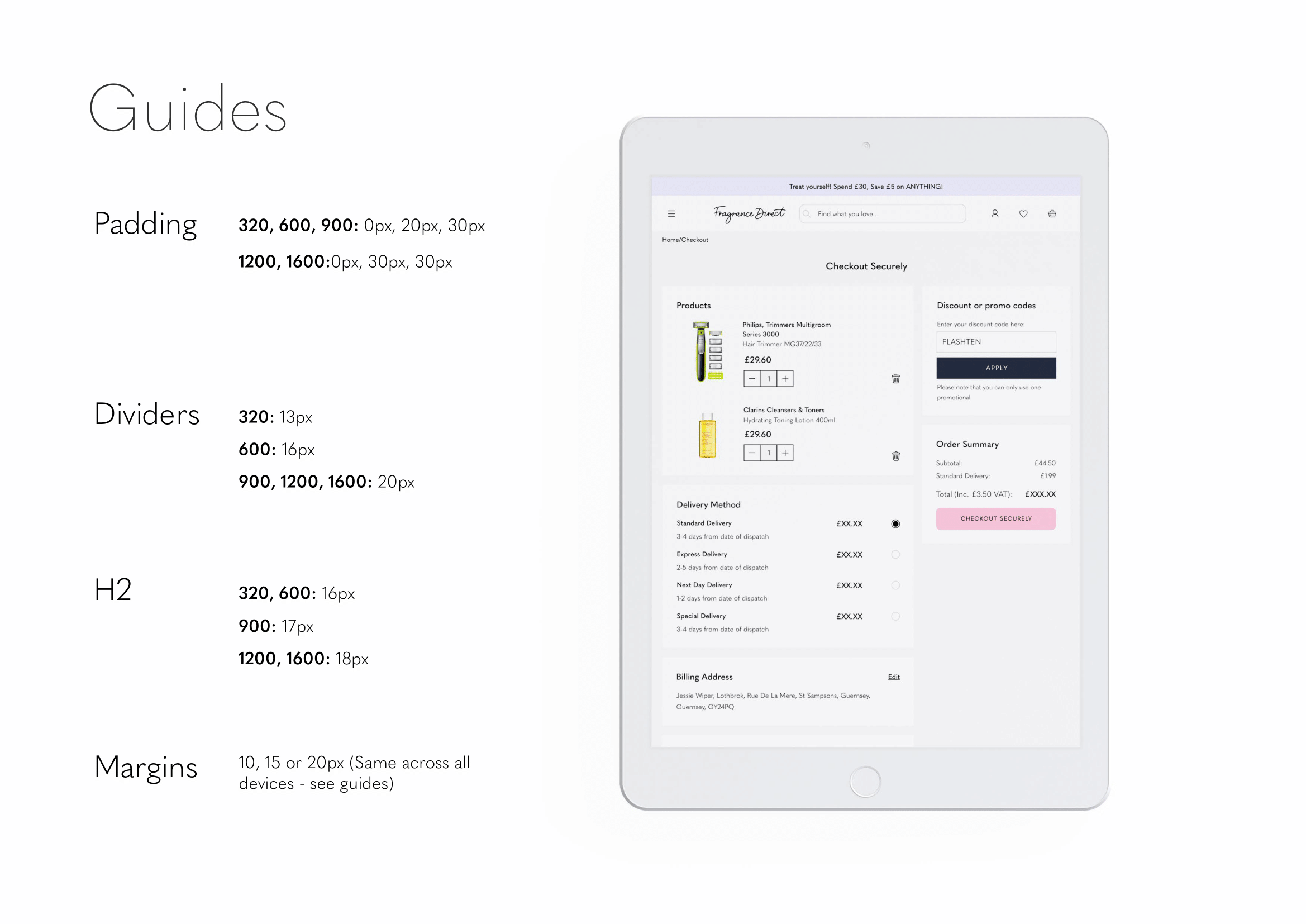
Padding, margins & sizing
The existing Fragrance Direct header has unnecessary space that disrupts visual hierarchy and usability. We need to reduce global height to improve alignment, minimise scrolling, and achieve a cleaner, more streamlined design.

Alongside reducing margins and padding, we also implemented a new design on tablet and mobile where the search expands to full-screen for better browsing, reduced screen noise, and improved touch usability. We also made sure to incorporate the following:
Smart Autocomplete – Predictive suggestions surface relevant products instantly, reducing user effort.
Structured Results – Recent searches, keyword suggestions, and top products improve navigation.
Error-Tolerant – Handles typos and partial inputs to prevent dead-end searches.
Visual Cues – Thumbnails, prices, and discounts help users make quick decisions.
Mobile-First Design – A clean layout with large touch targets ensures easy usability.
Optimising the shopping cart
Customers were dropping off at the cart stage, likely due to friction in adjusting quantities, unclear pricing, and a disjointed checkout process. Our goal was to design a shopping cart experience that simplifies decision-making, reduces abandonment, and ensures a smooth transition to checkout.

During the competitive analysis of leading retailers like ASOS and M&S, we identified key UX patterns preferred by younger audiences. One major insight was the preference for full-screen slide-out shopping carts. Additionally, subtle UX refinements — such as using a trash icon instead of a “remove” label. I also designed with the following in mind:
Clear UI: Organised layout with product images, prices, and discounts for quick scanning.
Easy Quantity Adjustments: Inline controls keep users in the flow.
Strong Checkout CTA: High-contrast button placed near the total to drive action.
Transparent Pricing: Discounts in red, free shipping in green to reinforce value.
Cross-Device Consistency: Seamless experience on mobile and desktop.
Slide-In Cart: Keeps users engaged without disrupting their journey.
Our goal was to create a footer that enhances navigation, builds trust, and supports global users while maintaining a clean, mobile-friendly design. The design would have to be flexible to cater for any additional social icons and easy to translate into different languages.
Keeping a “universal” footer

Designing a Footer for Usability, Trust & Accessibility
Streamlined Navigation – Collapsible menus keep it organised while ensuring key sections (Shopping Info, Customer Service) are easily accessible.
Global-Friendly Settings – Users can quickly adjust country, currency, and language without friction.
Trust & Security Reinforcement – Recognisable payment logos reassure users of secure transactions.
Social Engagement – Direct links to social media strengthen brand presence and customer connection.
Minimalist & Optimised – A clean layout ensures readability and smooth usability across devices.

Frictionless checkout design for higher conversion rates
I designed the checkout to keep users informed and ensure easy navigation. I prioritised readable typography, ample spacing, and intuitive hierarchy. Inline editable billing and shipping details reduce friction, and recognisable payment icons build trust. A transparent pricing breakdown and promo code section enhance confidence, while the final confirmation screen reassures order success. In comparison to the existing checkout, scroll space was reduced by 60%.


Frictionless checkout design for higher conversion rates
To avoid guesswork and ensure all designs were presented and signed off by the board, bi-weekly slides were created with detailed reasoning & any informed changes, along with pixel labels and comments. This ensured consistency in the build and development and allowed for all parties to be involved in the process.


Hey, I know you’ve been scrolling a while :)
Like I said, this project really was a big one! Just as a final point of call before you dash off to eat a crumpet or call your mum and tell her you’re interested in buying a new Marc Jacob’s perfume, I just wanted to show you how I extended some of the web design into CRM emails. Then you can go… pinky promise!


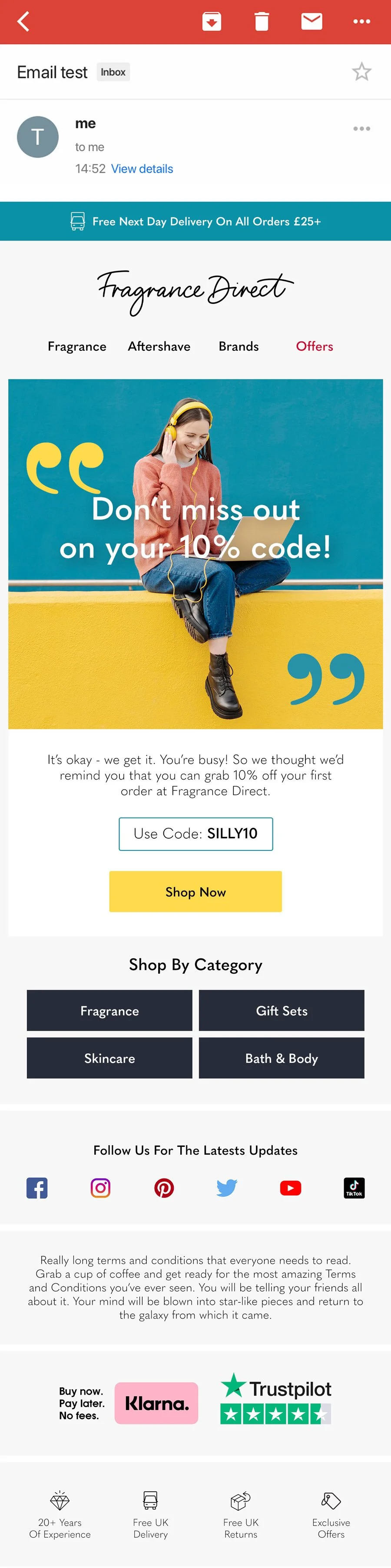
There’s more to show but this just covered the groundwork.